This page is an experiment to see how the use of AI to critique my images may help me to improve my photography.
The text is all AI generated by CoPilot.
Composition
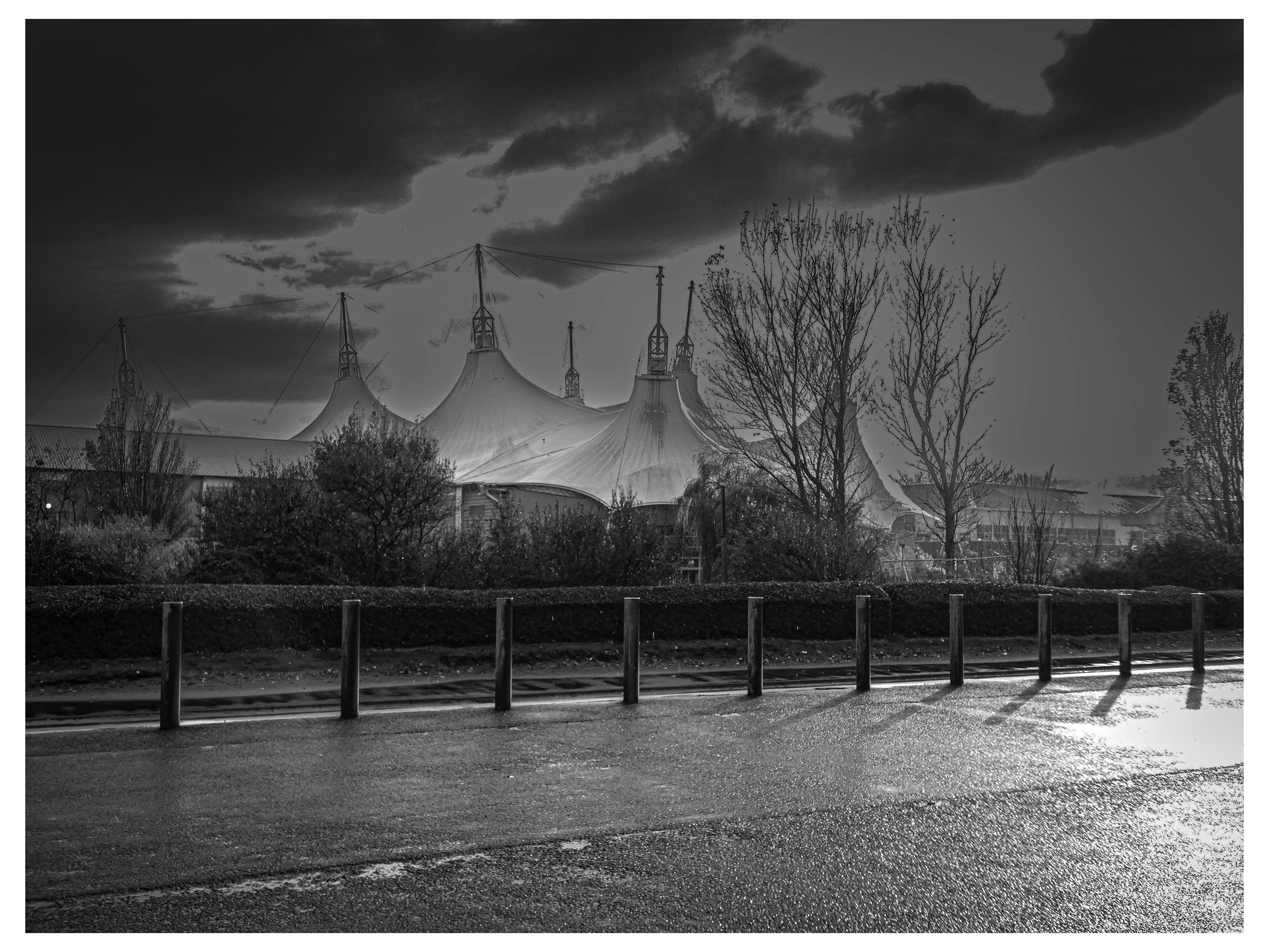
The image features a dramatic structure with tent-like peaks, likely a notable building or pavilion, set against a moody sky. The foreground includes a wet road and a row of bollards, which add depth and lead the viewer’s eye into the scene.
The placement of the main structure slightly off-centre creates a dynamic balance, while the trees frame the building and add natural texture.
Lighting and Contrast
The lighting is striking, with the sun either setting or rising behind the clouds, casting long shadows and creating a high-contrast effect. This enhances the drama and mood of the scene.
The wet surface of the road reflects light, adding interest and a sense of recent rain, which contributes to the atmosphere.
Tonal Range
The image is in black and white, which emphasises shapes, textures, and contrasts rather than colour. This choice suits the architectural subject and the dramatic sky, drawing attention to the interplay of light and shadow.
Mood and Atmosphere
The overall mood is somewhat mysterious and contemplative, with the dark clouds and stark lighting suggesting a moment of transition or anticipation.
The empty road and absence of people add to the sense of solitude.
Areas for Improvement
The bollards in the foreground, while adding depth, may slightly distract from the main subject. A lower angle or a different crop could reduce their dominance.
The sky, while dramatic, could benefit from a touch more detail in the highlights to avoid losing texture in the brightest areas.
Summary:
This is a well-composed, atmospheric black-and-white image that uses light, shadow, and architectural forms to create a striking visual impact. With minor adjustments to foreground elements and highlight detail, it could be even more compelling.
This is a well-composed, atmospheric black-and-white image that uses light, shadow, and architectural forms to create a striking visual impact. With minor adjustments to foreground elements and highlight detail, it could be even more compelling.
Technical Critique
Exposure & Lighting
The exposure is well-judged, capturing a wide range of tones from deep shadows to bright highlights. The backlighting from the sun behind the clouds creates a dramatic silhouette effect on the structure.
The wet road reflects light, adding visual interest and enhancing the sense of atmosphere.
Focus & Sharpness
The image appears sharp throughout, with clear detail in both the foreground (bollards and road) and the background (structure and trees).
Depth of field is sufficient to keep all key elements in focus, which suits the architectural and landscape subject.
Contrast & Tonal Range
The black-and-white conversion is effective, making good use of contrast to emphasise the dramatic sky and the unique shapes of the building.
There is a strong separation between the dark foreground and the illuminated sky, which helps to draw the viewer’s attention to the main subject.
Composition & Framing
The composition uses leading lines (the row of bollards and the edge of the road) to guide the viewer’s eye towards the structure.
The placement of the building slightly off-centre adds balance and avoids a static feel.
The trees on either side act as natural frames, containing the viewer’s gaze within the scene.
Artistic Critique
Mood & Atmosphere
The image conveys a moody, contemplative atmosphere, enhanced by the dramatic sky and the absence of people.
The choice of black and white removes distractions, focusing attention on form, light, and shadow.
Storytelling & Impact
The scene feels quiet and almost cinematic, suggesting a narrative or inviting the viewer to imagine what happens in this space.
The empty road and wet surface hint at recent rain, adding to the sense of solitude and reflection.
Suggestions for Enhancement
Consider experimenting with different angles or heights to see if the bollards could be less dominant, or if another perspective might reveal more of the structure’s character.
If possible, try capturing the scene at different times of day to explore how changing light affects the mood.
A slight adjustment to recover more detail in the brightest parts of the sky could add further depth.
Summary:
This is a technically strong and artistically evocative image. The use of black and white, dramatic lighting, and thoughtful composition all contribute to its impact. With minor tweaks to perspective or highlight detail, it could be even more powerful.
This is a technically strong and artistically evocative image. The use of black and white, dramatic lighting, and thoughtful composition all contribute to its impact. With minor tweaks to perspective or highlight detail, it could be even more powerful.
AI Visual Critique
Composition & Framing
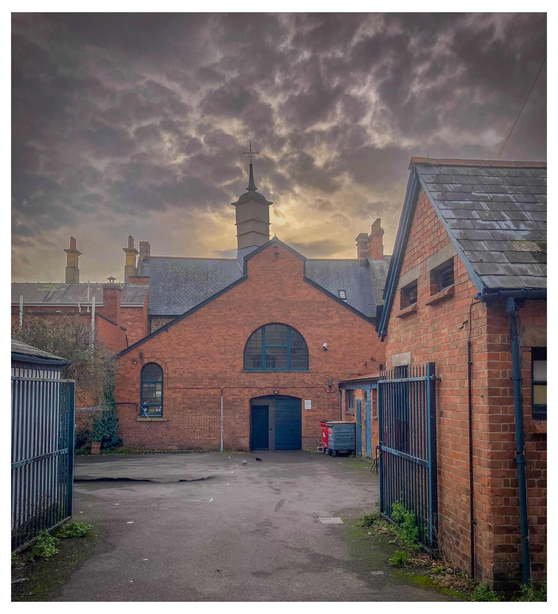
The image is well-composed, with the central building framed symmetrically by the two side structures and the gates. This draws the viewer’s eye directly to the main subject.
The perspective leads the viewer into the scene, creating depth and a sense of place.
Lighting & Atmosphere
The lighting is dramatic, with the sun breaking through a moody, cloud-filled sky. This creates a strong contrast between the warm tones of the brick and the cool, stormy sky.
The backlighting effect around the building’s spire adds a subtle halo, enhancing the focal point.
Colour & Tone
The warm red and orange hues of the brickwork contrast nicely with the blue-grey tones of the sky, making the architecture stand out.
The overall tone is slightly muted, which suits the historic and somewhat mysterious atmosphere of the scene.
Details & Texture
The texture of the brickwork and roof tiles is clearly visible, adding realism and interest.
The details in the clouds contribute to the dramatic mood, while the slight wetness on the ground suggests recent rain, adding to the narrative.
Mood & Story
The image evokes a sense of history and perhaps nostalgia, with the old architecture and dramatic sky suggesting stories untold.
The empty courtyard and closed gates add a touch of isolation or quietness, inviting the viewer to imagine what happens inside.
Suggestions for Improvement
Foreground Interest: Adding a subtle element in the foreground (such as a bicycle or a person) could enhance the sense of scale and add a narrative layer.
Exposure Balance: The sky is very dramatic, but some details in the shadowed areas (like the gate and the lower part of the building) are lost. Slightly lifting the shadows could reveal more detail without losing mood.
Vertical Correction: The verticals are mostly straight, but a slight correction could make the architecture feel even more imposing and balanced.
Technical Analysis
Exposure
The image is exposed for the sky, which creates a dramatic effect but leaves some foreground areas in shadow. This is a common technique for emphasising mood, but it can obscure details in the lower part of the scene.
Focus & Sharpness
The image appears sharp throughout, with good detail in the brickwork and roof tiles. The depth of field is sufficient to keep both foreground and background elements in focus.
White Balance
The colours are natural, with a slight warmth in the bricks and coolness in the sky. The white balance is well-chosen for the scene, enhancing the contrast between architectural elements and the weather.
Noise & Artefacts
There is minimal visible noise, even in the darker areas. The image quality is high, suggesting it was taken with a good camera or processed carefully.
Verticals & Perspective
The vertical lines of the buildings are mostly straight, but a slight tilt correction could make the image feel even more balanced and professional.
Editing Suggestions
Shadow Recovery
Use editing software to gently lift the shadows in the foreground and around the gates. This will reveal more detail without losing the moody atmosphere.
Contrast & Clarity
Increase local contrast and clarity in the brickwork to make textures pop. Be careful not to overdo it, as this can introduce unwanted artefacts.
Sky Enhancement
Consider selectively enhancing the sky’s drama with a graduated filter or by increasing the vibrance and contrast. This will make the clouds even more striking.
Vertical Correction
Apply a slight vertical perspective correction to ensure the buildings’ lines are perfectly straight, which adds to the sense of stability and professionalism.
Colour Grading
Experiment with subtle colour grading to emphasise the warm/cool contrast. For example, a slight increase in orange for the bricks and blue for the sky can enhance the overall mood.
Crop & Framing
If desired, crop slightly from the bottom to remove any distracting elements and focus attention on the central building.
Composition
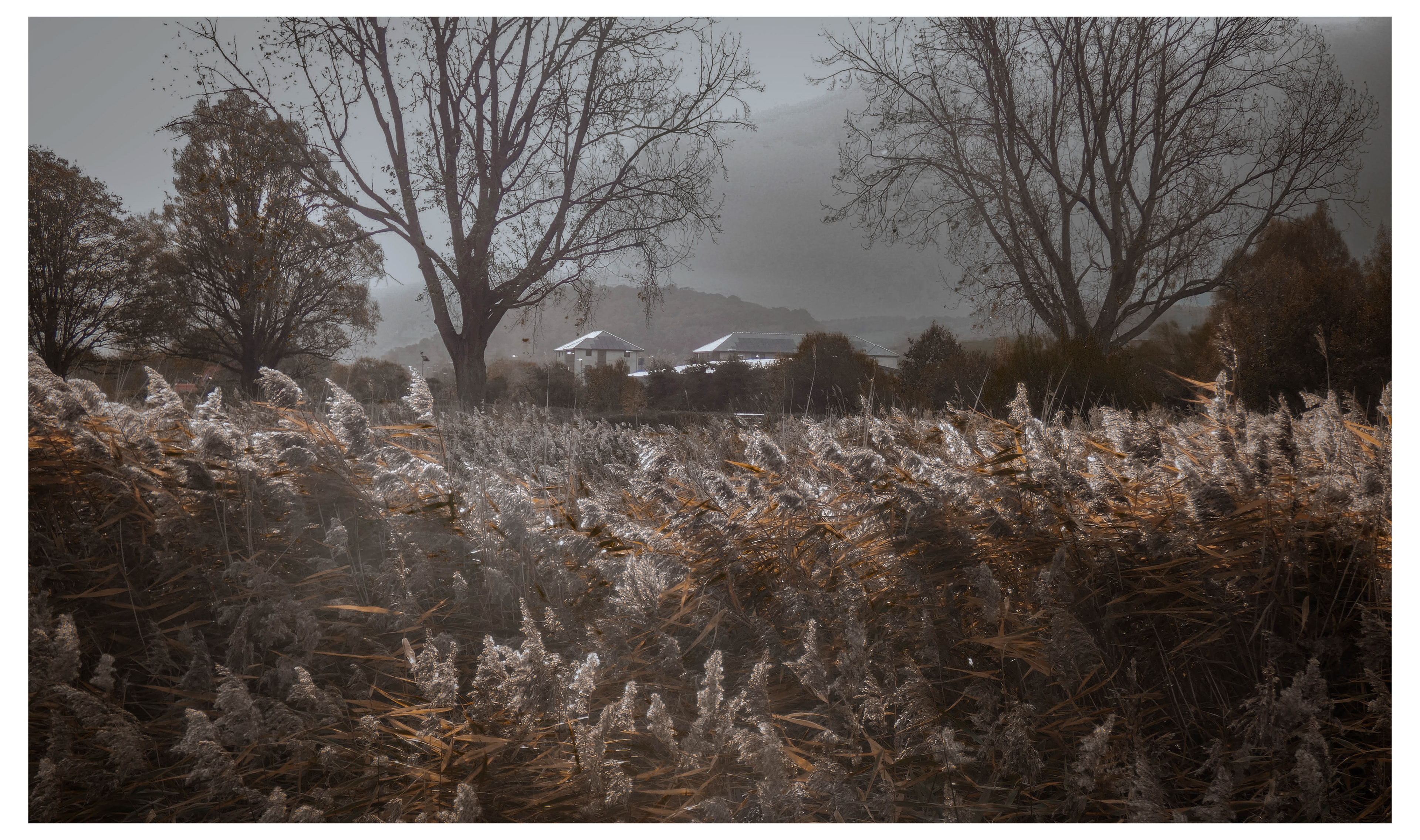
The image presents a moody, atmospheric landscape with tall grasses in the foreground, bare trees framing the scene, and a cluster of buildings nestled in the midground. The hills and cloudy sky in the background add depth and a sense of distance.
The use of leading lines from the grasses and the placement of the trees help guide the viewer’s eye towards the buildings, which become the focal point.
Lighting and Colour
The lighting is soft and diffused, likely due to overcast weather, which enhances the subdued, almost melancholic mood.
The colour palette is muted, with earthy browns and greys dominating. This choice supports the autumn or early winter feel and adds to the contemplative atmosphere.
Mood and Atmosphere
The image evokes a sense of quiet and solitude, possibly even nostalgia. The empty field and distant houses suggest isolation or peaceful retreat.
The mist or haze in the background softens the transition between the land and sky, contributing to the dreamy quality.
Technical Aspects
The exposure is well-balanced, with detail retained in both the highlights (sky) and shadows (grasses and trees).
Focus appears sharp throughout the scene, ensuring clarity in both foreground and background elements.
Areas for Improvement
The foreground grasses, while texturally interesting, occupy a large portion of the frame and may slightly overpower the main subject (the buildings). A lower angle or a slight crop could help balance the composition.
The sky, though atmospheric, could benefit from a touch more contrast or clarity to bring out cloud details and add drama.
Consider using a subtle vignette in post-processing to further draw attention to the centre of the image.
Summary:
This is a well-composed, evocative landscape that uses muted tones and soft light to create a strong mood. With minor adjustments to composition and post-processing, the image could become even more striking.
This is a well-composed, evocative landscape that uses muted tones and soft light to create a strong mood. With minor adjustments to composition and post-processing, the image could become even more striking.
1. Basic Panel Adjustments
Exposure: Adjust overall exposure to ensure the midtones are well balanced. If the image feels a bit dark, gently increase exposure, but avoid losing detail in the sky.
Contrast: Increase contrast to add depth, making the trees and buildings stand out against the sky and grasses.
Highlights & Shadows: Lower the highlights to recover detail in the sky and clouds. Raise the shadows slightly to reveal more texture in the foreground grasses and trees, but keep some shadow for mood.
2. Colour & Tone
White Balance: Fine-tune the temperature and tint to maintain the cool, muted mood. If you want a slightly warmer or cooler feel, adjust accordingly.
Vibrance & Saturation: Since the palette is already muted, use vibrance to subtly enhance any remaining colour without overdoing it. Avoid heavy saturation, as it may break the natural, subdued look.
3. Presence
Clarity: Increase clarity to bring out the texture in the grasses and trees, adding a sense of crispness.
Dehaze: Use dehaze sparingly to add definition to the misty background, but don’t overdo it or you’ll lose the atmospheric softness.
4. Crop & Composition
Crop Tool: Consider cropping a bit from the bottom if the grasses dominate too much, or from the sides to improve balance. Try to keep the buildings as a focal point.
Straighten: Make sure the horizon is level for a professional finish.
5. Local Adjustments
Graduated Filter: Apply a graduated filter to the sky to darken it slightly and add drama, increasing contrast or clarity just in that area.
Radial Filter: Use a radial filter to subtly brighten the area around the buildings, drawing the viewer’s eye to the focal point.
Adjustment Brush: If any area feels too dark or light, use the brush to fine-tune exposure or contrast locally.
6. Finishing Touches
Sharpening: Apply moderate sharpening to enhance detail, especially in the grasses and trees.
Noise Reduction: If you notice grain in the sky or shadows, use noise reduction carefully to smooth it out.
Vignette: Add a slight vignette to focus attention towards the centre and enhance the moody atmosphere.
Step-by-Step Lightroom Workflow
1. Import and Initial Setup
Import your image into Lightroom.
Switch to the Develop module.
2. Basic Adjustments
Exposure: Adjust the Exposure slider to ensure the image isn’t too dark or too bright. Aim for a balanced look, but keep the moody atmosphere.
Contrast: Increase Contrast to emphasise the dramatic lighting and separation between light and dark areas.
Highlights: Lower the Highlights slider to recover detail in the brightest parts of the sky.
Shadows: Raise the Shadows slider slightly to reveal detail in the foreground, but don’t overdo it—maintain the image’s mood.
Whites/Blacks: Fine-tune the Whites and Blacks sliders to set the tonal range. Hold Alt/Option while dragging to see clipping.
3. Black & White Conversion (if needed)
If your image is in colour, click “Black & White” in the Basic panel.
Go to the B&W Mix panel. Adjust individual colour sliders (e.g., Blue for sky, Green for foliage) to control brightness and contrast in those areas.
4. Clarity & Texture
Clarity: Increase Clarity to boost midtone contrast, making details in the structure and clouds pop.
Texture: Add a touch of Texture to enhance fine details in foliage and architectural elements.
5. Crop & Straighten
Use the Crop tool to adjust framing. Consider cropping out some foreground bollards if they distract from the main subject.
Straighten the horizon if needed for a professional finish.
6. Local Adjustments
Graduated Filter: Drag a Graduated Filter over the sky. Lower Exposure or add Dehaze to intensify drama and recover cloud detail.
Radial Filter: Place a Radial Filter over the main structure. Increase Exposure or Clarity slightly to draw attention.
Adjustment Brush: Use the Brush to selectively lighten or darken areas, or add clarity to specific details.
7. Sharpening & Noise Reduction
In the Detail panel, apply moderate Sharpening to enhance edges.
Use Noise Reduction if you notice grain, especially in the shadows. Don’t over-smooth—retain natural texture.
8. Vignetting
In the Effects panel, add a subtle Post-Crop Vignette to focus attention towards the centre and enhance the moody feel.
9. Final Review & Export
Review your adjustments. Toggle the before/after view to see the impact.
Export your image in the desired format and resolution for print or web.
Tip:
If you want to experiment further, try virtual copies with different crops or black-and-white mixes to compare results.
If you want to experiment further, try virtual copies with different crops or black-and-white mixes to compare results.
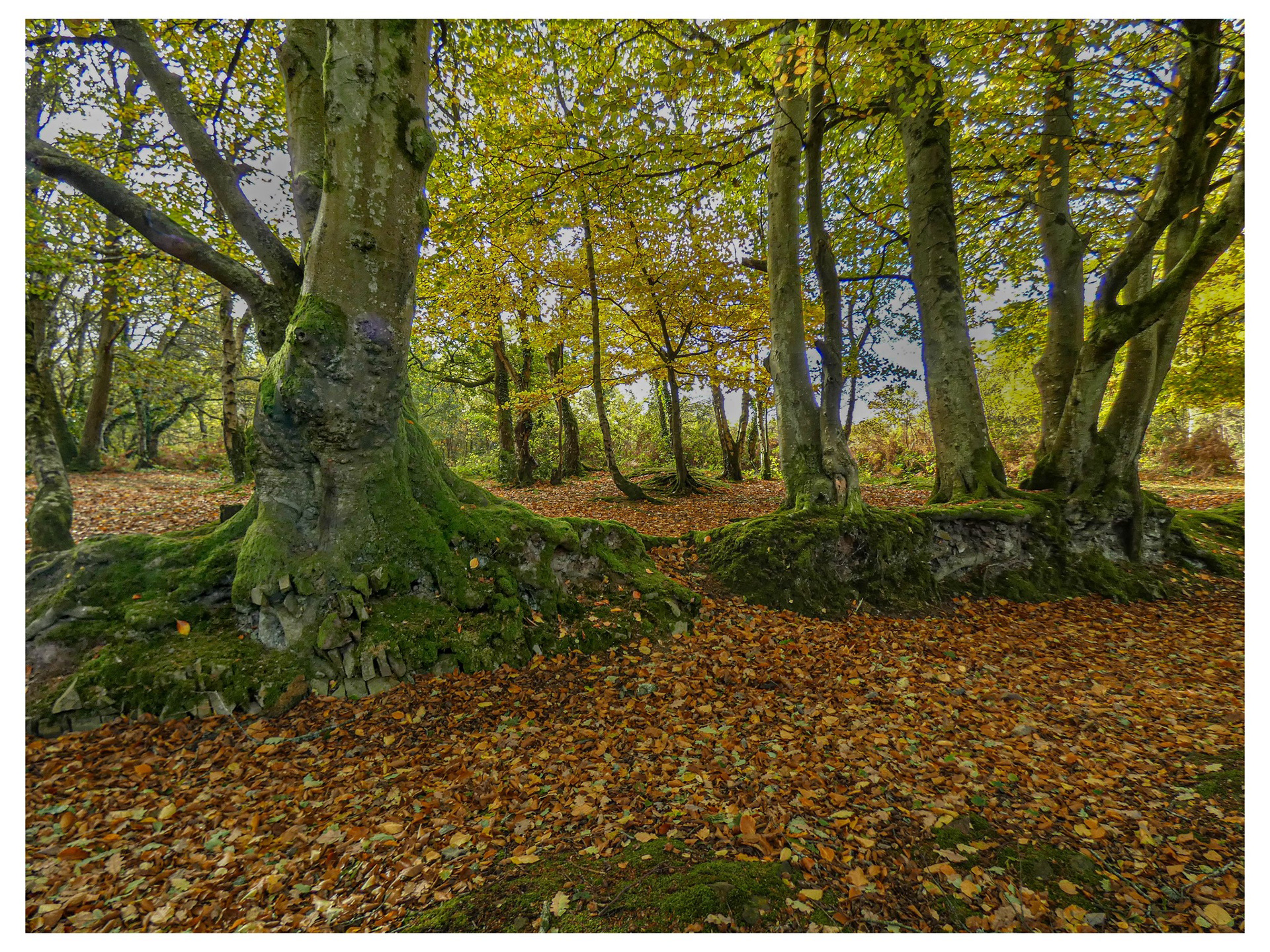
Image Critique: Woodland Scene
Composition
The image presents a tranquil woodland scene, dominated by mature trees with moss-covered trunks and roots. The trees are well-positioned, creating a natural frame and leading the viewer’s eye into the depth of the forest. The fallen leaves blanket the ground, adding texture and warmth to the foreground.
Colour & Lighting
The colour palette is rich in earthy tones—greens, browns, and yellows—which evoke an autumnal atmosphere. The lighting is soft and diffused, likely filtered through the canopy, which enhances the vibrancy of the moss and leaves without causing harsh shadows or overexposure.
Technical Qualities
Focus & Sharpness: The image is sharp, especially in the foreground, allowing details in the bark and moss to stand out. The background is slightly softer, which helps maintain depth.
Exposure: Well-balanced, with no areas appearing too dark or washed out.
Contrast: The contrast between the mossy greens and the warm leaves is pleasing and natural.
Artistic Impression
The scene feels peaceful and inviting, capturing the quiet beauty of a woodland in autumn. The use of perspective and natural lines draws the viewer into the image, encouraging exploration of the space.
Suggestions for Improvement
Perspective: Experimenting with a lower angle could emphasise the grandeur of the trees and add drama.
Depth: Including a focal point, such as a person or animal, might add narrative interest.
Seasonal Variation: Capturing the same scene in different seasons could provide a compelling series.
o improve the sense of depth in your woodland image, consider these practical techniques:
1. Use Leading Lines
Position elements such as paths, fallen branches, or rows of trees to guide the viewer’s eye from the foreground into the background. This creates a visual journey and enhances depth.
2. Include Foreground Interest
Add objects or textures close to the camera—such as rocks, leaves, or roots. A strong foreground anchors the scene and gives a sense of scale.
3. Layer Elements
Arrange trees and foliage in distinct layers (foreground, midground, background). Overlapping objects naturally create depth.
4. Adjust Aperture
Use a wider aperture (lower f-number) to blur the background slightly, making the foreground stand out. Alternatively, a narrower aperture (higher f-number) keeps everything sharp, which can also emphasise depth if layers are present.
5. Play with Light and Shadow
Capture scenes where sunlight filters through the trees, casting shadows and highlights. This contrast adds dimensionality.
6. Atmospheric Perspective
On misty or foggy days, distant objects appear lighter and less detailed. This effect can dramatically increase depth.
7. Change Your Viewpoint
Try shooting from a lower angle or from behind a tree or bush. This can frame the scene and add a sense of immersion.
Editing Techniques to Enhance Depth
1. Adjust Contrast and Brightness
Increase contrast between foreground and background. Make the foreground slightly brighter and more vivid, while subtly darkening or desaturating the background. This separation helps objects “pop” and creates a sense of distance.
2. Apply Selective Blur
Use a blur tool (such as Gaussian Blur) on the background or distant elements. This mimics shallow depth of field and draws attention to the foreground.
3. Add Vignetting
Apply a gentle vignette effect to darken the edges of the image. This focuses the viewer’s eye towards the centre and enhances the feeling of depth.
4. Use Dodging and Burning
Dodge (lighten) areas in the foreground and burn (darken) areas in the background. This technique, borrowed from traditional darkroom photography, adds dimensionality.
5. Enhance Atmospheric Perspective
Reduce clarity, contrast, and saturation in the background. If possible, add a subtle haze or mist effect to distant trees, making them appear further away.
6. Colour Grading
Warm up the foreground colours and cool down the background tones. This temperature difference can help separate layers visually.
7. Sharpen Foreground Details
Apply sharpening selectively to foreground elements (like moss, bark, or leaves) to make them stand out against a softer background.
8. Crop for Composition
Crop the image to emphasise layers or leading lines. Removing distractions at the edges can help guide the viewer’s eye through the scene.
Adobe LR Work flow:
1. Adjust Contrast and Brightness
Use the Basic panel to increase contrast.
Brighten the foreground using the Exposure or Shadows sliders.
Darken the background with the Graduated Filter or Radial Filter.
2. Selective Blur
Lightroom doesn’t offer true blur, but you can use the Adjustment Brush to lower the Clarity and Sharpness in the background areas, simulating a soft-focus effect.
3. Vignetting
Go to the Effects panel and use the Post-Crop Vignetting slider to darken the edges gently, drawing attention to the centre.
4. Dodging and Burning
Use the Adjustment Brush to paint light (dodge) onto the foreground and dark (burn) onto the background.
Adjust the Exposure slider within the brush settings for precise control.
5. Atmospheric Perspective
Use the Dehaze slider in the Basic panel. Lowering Dehaze in the background can add a misty effect.
Reduce Clarity and Contrast in distant areas with the Adjustment Brush.
6. Colour Grading
In the Colour Grading panel, warm up the highlights (foreground) and cool down the shadows (background).
Use the HSL panel to selectively adjust colours for more separation.
7. Sharpen Foreground Details
Use the Adjustment Brush to increase Clarity and Sharpness on foreground elements like moss or leaves.
8. Crop for Composition
Use the Crop tool to refine your composition, emphasising layers or leading lines.
Tip: Use the Masking tools (Brush, Linear Gradient, Radial Gradient) for precise, local adjustments. This allows you to target specific areas for depth enhancement.
Step-by-Step: Creating Depth with the Adjustment Brush
1. Select the Adjustment Brush
In the Develop module, click the Adjustment Brush icon (or press ‘K’ on your keyboard).
2. Set Brush Settings
Decide what effect you want for depth:
Foreground: Increase Exposure, Clarity, and Sharpness to make details stand out.
Background: Decrease Clarity, Contrast, and possibly Exposure to soften and push elements back.
3. Paint Over Areas
Use the brush to paint over the foreground (roots, leaves, moss) with settings that make it brighter and sharper.
Paint over the background (distant trees, leaves) with settings that make it softer and less defined.
4. Fine-Tune the Mask
Adjust the Feather and Flow sliders for a natural transition between edited and unedited areas.
Use the Erase option to clean up any overpainting.
5. Layer Multiple Brushes
You can add multiple Adjustment Brush masks for different parts of the image, allowing precise control over each layer (foreground, midground, background).
6. Review and Refine
Toggle the mask visibility to check your work.
Adjust the sliders for each mask until the depth effect looks natural.
Tips:
Use a large, soft brush for broad areas and a smaller brush for details.
Subtle adjustments often look more realistic than dramatic changes.
Combine with other tools (Radial or Graduated Filters) for e
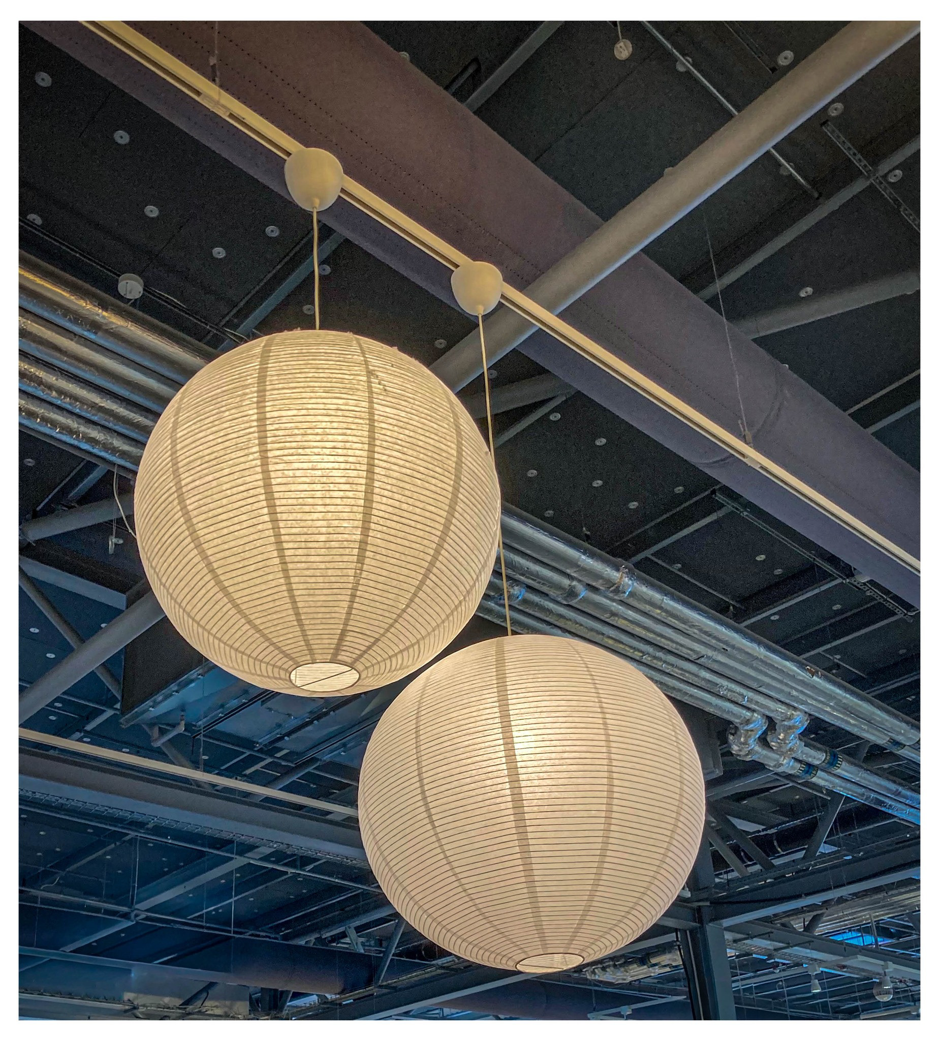
Image Critique
The image depicts two large, spherical pendant lamps suspended from the ceiling in an industrial-style interior. Here’s a detailed critique:
Composition & Lighting
Balance: The lamps are positioned slightly off-centre, creating a sense of dynamic balance. Their similar size and shape provide visual harmony.
Lighting: The lamps emit a soft, warm glow, which contrasts with the cooler, more industrial tones of the ceiling and exposed pipes. This interplay adds depth and interest to the image.
Texture: The lampshades have a ribbed texture, which is accentuated by the light passing through them. This detail draws the viewer’s eye and adds tactile appeal.
Context & Atmosphere
Setting: The exposed ceiling, visible pipes, and beams suggest a modern or repurposed industrial space, possibly a café, workspace, or gallery.
Mood: The warm light from the lamps creates a welcoming and cosy atmosphere, softening the otherwise utilitarian environment.
Technical Aspects
Focus: The image is sharp, with clear details on both the lamps and the background elements.
Colour: The palette is restrained, dominated by neutral tones (white, grey, beige), which helps the lamps stand out as focal points.
Suggestions for Improvement
Framing: Cropping slightly tighter could emphasise the lamps even more, reducing the amount of ceiling space and focusing attention on the main subjects.
Contrast: Increasing the contrast between the lamps and the background could make them pop further.
Contextual Elements: Including more of the surrounding environment (such as furniture or people) might provide additional context and narrative.
Here are several ways you could enhance this image for use in a presentation:
1. Adjust Brightness and Contrast
Increase the brightness and contrast slightly to make the lamps stand out more against the industrial ceiling.
This will help draw the audience’s attention to the focal point.
2. Crop for Focus
Crop the image to remove excess ceiling space and centre the lamps.
A tighter crop will make the image more impactful and reduce distractions.
3. Add a Subtle Vignette
Apply a vignette effect to gently darken the corners, further focusing attention on the lamps.
4. Enhance Colours
Slightly warm up the colour temperature to emphasise the cosy glow of the lamps.
Alternatively, convert to black and white for a minimalist, modern look.
5. Overlay Text or Graphics
Add a title, caption, or key message directly onto the image using a clear, readable font.
Place text in an area with minimal detail (e.g., the top or bottom) to maintain clarity.
6. Use as a Background
Lower the opacity and use the image as a subtle background for a slide, with content layered on top.
7. Highlight Details
Use arrows or circles to highlight specific features (e.g., the texture of the lampshades or the industrial ceiling).
8. Frame the Image
Add a thin border or drop shadow to separate the image from the slide background, making it pop visually.